Tuesday, May 28, 2013

SH "Hard as Nails" Review


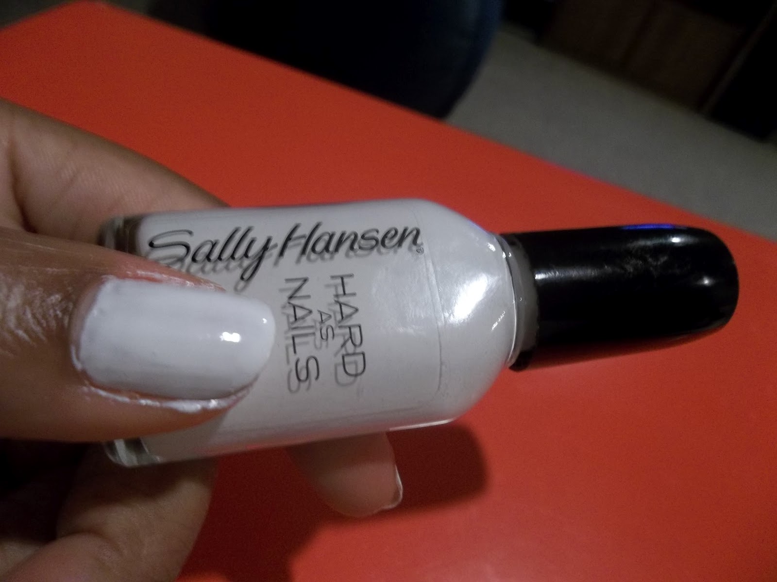
First up on the "back to posting" playlist: Sally Hansen Hard as Nails Review ($1.19)

I admit to being thrifty (I actually wrote one of my college essays on my thriftiness) but anyway, I let my thriftiness come into play when buying my first full sized white nail polish.  I already owned a mini bottle of OPI Alpine Snow and basically used it up.  So I decided it was time to buy a new one.

I originally thought that the nail polish didn't really need to be that great of a brand because I wouldn't really be wearing it alone...I was wrong.

The application with this Sally Hansen Hard as Nails white nail color (too lazy and annoyed to look up that actual name) was terrible.  I know whites can be streaky on the first coat, but this one was unbearable.  Even on the second coat I could tell that it was still streaky and uneven.  I didn't do third coat...I could already tell that nothing was going to save this nail color.

Here are some photos:

First coat

Second coat
(my thumb was the best looking one)

The intent for this mani was to have a white base for a sunset gradient design.  I did complete the manicure (I do have a post in my draft folder, I"ll post a link to it later) but it looked bad.  Only one nail really came out well.  I'll talk more about that in the actual post.

Final Verdict:  Cheap for a reason!

Note: I will be using this polish for water marbles and anything else that wastes polish.  That's how frustrated I am.

Hey.......

Hello, again...finally.

Sorry I have been M.I.A. again after my little surprise visit in January.  I just got so caught up in my last semester of high school and applying to college.  

But...it's summertime.  I am taking some summer courses at the community college, other than that, there will be plenty of time to do my nails.

Actually, I did my nails every week this past semester and have continued them up till now, I just didn't take any pictures (shame on me).  I have several drafts to finish, though, and I took a picture of the nails I'm wearing this week.

So get ready for some frequent posts, some throwbacks, and some awesome reviews to come.  I promise.  Pinky swear =] 

Friday, December 28, 2012

17 Challenge: Stripes

Hey Everyone,

I don't know what I have been doing....no, wait!  Yes I do: Chemistry, Calculus, Biology, Spanish, English, and P.E.  (I include P.E. because that class almost got the best of me this semester).  But I'm not here to complain.  The semester is over which means time for more blog posts!!

I have a lot of posts that have been drafts since the June or July, and this is one of them.


I chose to do yellow background with silver stripes for this 17 Challenge

Colors Used:
Lexington Yellow by NYC
Silver Striper by KISS


And one more picture...


I really am going to post more often. It's almost the new year and I am striving to follow through with my resolution of painting my nails once a week.  Actually I successfully did this in 2011, and was going strong through the first half of 2012 until my senior year started.  But anyway, I have been hunting for nail designs and marking them in my planner, and I always do follow through with things when they are in my planner.


I have about 5 more draft posts so look out for those.  I hope everyone had a very Happy Holidays.  I won't wish you a Happy New Year, though, because I am going to post before then...I promise.

Tuesday, August 7, 2012

17 Challenge: Pastel


Hello Again,


Yet another installment in the 17 Challenge Nail Design series!  Today I present to you, pastel nails.

I originally did a plain mani with my pastel peach color.   A day later, I decided to add some flower detail on my accent finger for a little more summery and floral look.

Overall, a pretty easy and simple 17 Challenge.


Shade


Colors Used:

Peach Parfait by Ulta
Luxe by Orly (gold dots)
White Out by Orly


And because the perfection and easiness of the nail polish made for pretty photos, I present you with more pictures below.

Shade
Sun (sorry for that glare)

Indoors

I will be posting a tutorial on how to do the flowers on my ring finger, so look forward to that.

Until next time <3

Influenster: Hawaiian Tropic Silk Hydration Lotion Sunscreen Review

Hello everyone,

Influenster Summer Beauty VoxBox

This is the first post of several Influenster posts.  If you do not know what Influenster is, it is a free testing service where you get a package (called a VoxBox) filled with new products that you must test.  Here is a link to the website: www.influenster.com, I highly encourage you to sign up!

This picture to the right is just a collective photo of all the products I received FREE from Influenster.


So in this post I will be reviewing Hawaiian Tropic Silk Hydration Sunscreen Lotion if SPF 30.  It also comes in SPF 12 and 50.  A 6 oz bottle is priced at $8.99.

This was one of the products that I saw and wasn't really that excited about it, until I realized that I was...if that makes since.  Basically I haven't been one to use sunscreen (bad, I know) but when I got this it just made sunscreen more appealing.

First of all, it is a sunscreen lotion.  This is very evident in the way that it applies.  It doesn't just sit on your skin like most sunscreens I have tried in the past, but it actually hydrates your skin and supplies it with moisture and protection.

As far as the scent goes, it does smell a little bit like a sunscreen; but, it also has a nice relaxing sweet and summery smell that is subtle but still detectable.


I am really pleased with this product.  The bottle I got is 2 fl oz and is just the right size for my purse or backpack and makes applying on the go very easy and convenient.

DISCLAIMER:   I received this product complimentary for testing purposes from Influenster.

Thursday, July 19, 2012

17 Challenge: Polka Dots

Good evening everyone!  Like I promised, I have another nail design to share. 

This is another post in the "17 Challenge Series:" PoLka DoTs (for some reason I thought that alternating upper and lower case letters would look like polka dots...)


The base color is Strawberry Margarita by OPI and the dots are made by using NYC Lexington Yellow (shown in the picture above) and a distorted bobby pin.  Of course Seche base and top coats were used.  

I also use OPI Chip Skip, but I'm not quite sure if that actually makes a difference.  That'd be a great future post, an experiment to see if it actually makes your nails skip chips.  I'll keep that on the back burner for ideas.  I'll even start a draft so that I don't forget. 

The pamphlet that had the suggested 17 designs showed the polka dots as just scattered around each nail, but since I didn't really want that many polka dots, I decided to just do two lines of polka dots that "take a journey" across the width of each nail.  I tried to connect the lines from nail to nail, but it was kinda hard to line them up.  This was the best I could do.


The Strawberry Margarita was just a mini OPI nail polish.
\My hand isn't gigantic, if that's what you thought.


Overall, I think this is an interesting and fun take on the regular polka dots.  And it's so easy too, it's like using a stamp, it's hard to go wrong.  

Stay tuned for more 17 Challenge nail designs, as well as other nail polish posts and my first Influenster post.  If you don't what Influenster is, then I guess you'll just have to come back and read about it.  In the meantime, you can go ahead and vote for your favorite nail polish in the poll on the left and look at previous posts.

Until next time : )

Wednesday, July 18, 2012

NOTW: Shimmer Gradient

...and I'm back.

Sorry about the very long delay. (So much for having summer to catch up on blog posts).  Every time I even thought about posting a blog, the idea of me typing on a  Sunday afternoon in between doing physics homework over the internet and analyzing rhetorical pieces for English just made me want to take a nap.  

With less than a month till school starts, I am getting back on track, starting with getting my typing skills up and running with nail blog posts.  

This week's notw screams summer.  If you aren't familiar with this color by now, I'll give you a break since it has been over two months.  This is Finger Paints "Drawn to this Shade."  This really is my go to color for all year long.
Sunlight
I just used Seche Clear base coat and two coats of FP for the base color.  Then, I used a torn makeup sponge and Orly Luxe to create the shimmer gradient and smoothed it out with Seche Vite top coat.

A while ago I tried to do this nail effect but failed and ended up just do a sponged shimmer all over the nail.  Click here to view that one!  I managed to keep the shimmer on the upper half to third of the nail, and I really like the way it turned out.

Shade
The red hue it produces in the shaded picture is a little more orange in real life.  However, the following pictures more accurately capture the coral hue of Drawn to this Shade.  I really could have only used one more picture, but the shimmer from Luxe is just so eye catching.


What I am about to say may sound familiar, but I am serious this time.  I have more posts to come, both soon and frequently.  Seriously, I have about 7 or 8 drafts with pictures all ready to go.

Until next time <3

Friday, June 1, 2012

I Went Shopping!!!


So I had a lot of errands I needed to do yesterday.  I had to go to the post office, pick up some stuff from Trader Joes, and return some things at the library.  And even though it was 11:30am, it was so busy.  But since I was over by a Sally's, I figured I might as well just stop on by and see what they have on clearance.


Normally when I go to Sally's they always have nail polish deals like Buy 2 Get 1 Free.  I hadn't heard of any of those for a while and they didn't have any signs up when I went there, so I just decided to go in there and head directly for the clearance rack so I wouldn't spend too much money.


The only thing I don't like about the clearance section at Sally's is the fact that it makes me second guess myself.  For example, I find a polish that I think looks really cute and I think about getting it.  But then all of a sudden I start to wonder why it's on clearance.  I mean, did they put it on clearance because it was so ugly and nobody would pay full price for it?  That sounds plausible, right?


However, I have managed to convince myself that the only reason why those polishes are over there is because people bought the polish so quickly, that there was only one or two left.  And of course these polishes are just limited edition, so when they want to refill the section on the nail polish rack, there isn't any more of the color.  So they are forced to remove it and discount it so they can at least put it somewhere.  With that type of thinking, I buy my clearance polishes.

Comment below if you know what I am talking about!!!


Yesterday I managed to trick/convince myself into getting two polishes.  The one of the left is an Orly color.  Have I mentioned how much I love Orly nail polishes?  I really do.  Anyway, this is a taupy grey color. When I saw this I was really excited.  I wanted to get Stiletto from Julie G's collection, but never got around to it.  This one doesn't sparkle like Stiletto does, but the color is pretty close.  It was on sale for $2.69.


The little guy on the right is by Sally Girl and is called Coconut.  This was on sale because it was a featured scented polish that obviously will smell like coconut.  I tried it on real fast when I got home and it actually smells like coconut. They had some other colors, but I figured I'd just get one.  Also, this polish will be able to satisfy my pastel requirements for the 17 challenge (click here to read more about it).  This little thing was only 69 cents.  Yay for deals!


Overall, I got two new nail polishes, and I can't wait to test them out and see what designs I can make with them.

Until next time. . .

Monday, May 28, 2012

17 Challenge: Mix It Up


As I promised, I have the first installment of  the Seventeen Magazine nail challenge I have started for this summer and on.  (Click here to read more about it)

I actually did this nail design last Thursday, but I was busy enjoying my first few days of summer break to post about it, but now that it is the first full week of summer break, I have found some time.

This design was #13: Mix It Up.
The description of these nails was to paint all your nails one color and then do an accent nail on your ring finger.  I normally don't really like to do one nail a completely different color with nothing that ties it into the other nails, so I'm glad this was a challenge because otherwise I would not have tried this.


The colors I used were Finger Paints "Drawn to this Shade" (no surprise here, this is only about the 10th time I've done a post on this color).  But I did use this new color my mother got me a couple of months ago.  It is called "Stranger Tides" from OPI's Pirates of the Carribean collection.  It was only a dollar at this nail store that was going out of business.  


Actual color of the dusty green

I really didn't know when or how I was going to wear this dusty pale green color, but it contrasts nicely with the coral and I have started to really like it.   I used one coat of the coral and two coats of the dusty green because it goes on pretty streaky at first.

I also think that this accent nail is really cool.  My mom and brother, who's home from college, don't really understand why one color is painted differently.  I just tell them "17 Challenge" and they don't bother me anymore.  Lol =]


If OPI is your favorite nail polish brand, just go ahead and vote for it in the poll on the left.  If it is Finger Paints or something else, vote for that one.

I hope everyone is having a good Memorial Day...and I'll see you next time for another edition of the 17 challenge (or a random post or something).

Saturday, May 26, 2012

Summer's Almost Here

UPDATE: You can now click on the nail designs in the list below to take you to the blog post about it.

I know it has been a while since I posted a nail design, nail tips, or basically anything, but school is finally out, which means that finals are OVER.

This means I will have more time to actually do my nails.  I haven't done them since my last post and they look terrible.  A manicure is definitely needed.  So look forward to more nail tips and designs.

Also, I received the latest issue of Seventeen magazine in the mail and it came with a little packet of 17 different nail ideas.  So what I am planning on doing is trying all 17 ideas by the end of this year.  NOTE: this does not mean that it will be all 17 in a row.  I like to alternate sometimes between plain or simple designs and the more complex and busy designs.  But I will definitely have them all "worn" and posted about by the end of the year.

Here are the 17 nail designs:
  1. Stripes
  2. Neon
  3. Polka Dots
  4. Glitter
  5. Lace
  6. Stars
  7. Newspaper Print
  8. French Tips
  9. Graphic
  10. Tie-dye
  11. Cute Tattoos
  12. Swirls
  13. Mix It Up
  14. Stickers
  15. Pastel
  16. Tribal Print
  17. Half Moons
As I was typing this list, I realized that I didn't have a lot of the colors or supplies to make these designs, so yesterday I went shopping and found some of the ones that I needed for a couple.  I still have some more nail polishes on my list, but I do have enough for the next two or three designs.  

I started off with one of the rather easy designs: #13 Mix It Up.  Look for that post in the very, very near future =]

Comment below if you have any nail designs that you want me to try!
And don't forget to take the poll to the right of this post on your favorite nail polish brand!

Saturday, May 5, 2012

How To: Color Blocking

Good evening everyone!

Tonight I am going to share with you all a how-to post on how I made the color blocked accent nail from my last post: NOTW Perfect Peach.

Oh and FYI, if you are reading this post late Saturday night, look outside.  The moon is the brightest that it has been this year, and probably for a couple of years.  The sky literally looks blueish purple where I live.


So back to nails.

Step 1: Paint your nails a solid white color.  (I had to use white because these colors were very sheer when applied just to the bare nail.)  Then use a black striper to create a bunch of little sections.  


The thing I don't like about this design is that it kind of looks 
like I was trying to make a star and then messed up, 
which I wasn't.  So just be careful that the design looks varied,
like in the first picture.

Step 2:  Fill in one or two spaces with one color.  I just used the tip of a small bobby pin.  Take the nail polish brush out of the bottle and just dip the bobby pin into the brush.  I tried to put dots on paper, but I think dipping the pin directly into the polish is easier.


Step 3: Repeat step 2 until all the spaces are filled.  Be careful not to get any color right next to each other.  Here's a link to the post of the swatches from this color collection along with the names.


In this picture, I have actually two different oranges on.
The space on the top right and the space on the
bottom left is the color I painted the rest of my nails
in the last post.


Here is the pink color.


The red-orange color.


And finally the yellow.

Just take a cotton swab dipped in nail polish remover to clean up around the edges.

Overall, I like the way this nail turned out.  If it didn't look so much like a star, I think I would have liked it better.  The funny thing is that I like my accent nail on my left hand.  I'm left handed, so I thought my right hand wouldn't make the design look as pretty since it was my non-dominant hand. But I really like the effect, so I had to include a picture:


This nail design is really simple.  I even think it would look great as a design for all the nails, but I'm just too lazy and impatient to sit through and paint all of them like that.

Comment below if you like the design or if you have any questions.

See you all later <3

P.S.  I did my friend's nails yesterday for tonight's prom.  I wish I had taken a picture because it was this really pretty gold and white water marble with glitter sparkles.  Maybe later on this year I'll do it on my nails and show it to you all.  It was just that pretty.  So look forward about a month or two for that one.  But I will be doing another water marble design either for this upcoming week or the next.  I don't know...with finals and AP exams,  I'll try to find time.  Okay, this really is the end of this post.

Monday, April 30, 2012

NOTW: Perfect Peach

Happy Monday Night!

If you all looked at my post yesterday about my Ulta purchase, you already have a sneak preview for the nails I am about to show you all.  If not, here's a link to yesterday's post, or you can just keep on reading.

Sunlight


I think this type of nail design is called color blocking, but it my version may be different because they sections are not really blocks.  But anyway, I was really excited about this.  Like I said yesterday, I am finally glad I found my perfect orange.  This is Tu-Lip Service by Ulta.  It's a glittery orange-peach that has a little bit of a gold hue to it in some lights and in the bottle.


Shade

For this notw, I have two coats of Tu-Lip Service "wedged"     between Seche Clear (basecoat) and Seche Vite (topcoat).  The color really is pretty opaque, but when the sunlight hits it plus the use of my camera, it does look like the smile line is showing a little on my index and pinky fingers.  But it's hardly noticeable in real life.


I think another really cool thing about this nail polish (well all of the Ulta minis) is that it is the perfect size.  I have always complained about OPI's minis and that they are extremely tiny.  But these cuties are 7ml.  They have the perfect brush as well.  I feel like it's one of the nail polish bottles that allows you to get all the nail color out, and minis are especially hard to do that with.  Not this one.  I mean, if Ulta sold all their polishes this size for like $1.50 or $2.00 my nail polish collection would probably have three times as many nail colors as it does now.

As much as I like the little bottle, this color really is pretty enough for a full bottle.  But until Ulta makes one, I guess it's just me and the little guy for now.

Oh, and lest I forget my accent nail.
I took step by step pictures on how I did it; however, this is already a really long post, and I am kinda tired and still have history work to do, so I will post a tutorial later on this week.

But if you still want more nail polish designs, just check out some of my other posts in the archive section on the right side of my blog.

Here are some more pictures of this week's mani:


Sunlight

Shade


Sunday, April 29, 2012

Ulta Skittle Nails

Hey Everyone,

It is Sunday!  Yesterday I got up really early in the morning to drive two hours to perform a three minute song for a state competition.  As tired as I was, I drove all the way back.  But when we got back in the city, my mother and I decided to stop at Oberweis to buy some ice cream.  So anyway, long story short, I decided to stop at Ulta.  I had $3.50 off coupon for a while now and decided to use it.

Here's what I bought:


This is a five pack mini nail polish called "In Bloom."  The colors are exactly what I have been wanting.  I cannot tell you how long I have been looking for a perfect orange.  These are the perfect colors for summer!

Four of the five colors are glitters and one is an opaque orangish-coral.  This colors are  (in left to right): Snap-Dragon Me Down, Voted Most Poppy-ulur, In a Daisy, Tu-lip Service, and Fleur-ever Yours).


All the glitters are pretty sheer, so for my skittles swatch, I decided to layer them over one coat of Opi's Alpine Snow.  I just have a tiny bottle of the white polish, so the white coating underneath the base color is not well done, but I didn't plan to leave this on all day.  Actually I have a new design on now.  So yeah, I apologize for the terrible nail job I did. 

Here is a sneak preview for the nail design I have on my nails now, and what I will be sharing with everyone tomorrow:


"Color Blocking"


Look for tomorrow's post for the full manicure!
Until then, <3

Thursday, April 26, 2012

Stirred NOT Shaken

So this is just a quick post to talk about actual nail polish.  I am taking a break from writing a 5 page history paper on the political development of Iran to tell you about this.  So it must really be important.

You know right before you paint your nails and you look at the nail polish bottle and it looks like the colors have separated?  For me it tends to happen with my light purples and blues where the darker hues float to the top, but every nail polish is different. 

Here's an example of a polish that I always have to shake two or three times before I can use it.  It's Orly's Snowcone, and not only does the polish separate really fast, but I spilled the bottle.  That's why it looks really gross on the outside.

Don't you just hate when the happens?

So anyway, what do you do to make the color come back to the original?  The easiest way would be to shake it.

I bet you all have heard this a thousand times, but DON'T SHAKE THE NAIL POLISH BOTTLE. It does actually make a difference.  When you shake the bottle, bubbles form.  Just like if you shook a bottle of water, you are going to produce bubbles.  Albeit the bubbles will not be as noticeable in the bottle, (especially when you paint your nails) but when your nails begin to dry, there will be tiny bubbles.

Sometimes a top coat, like Seche Vite, will take away the bubbles, but they will still look very unappealing.

So how can we prevent this from happening?

  1. Use a different nail polish
  2. Roll the bottle between your palms if the color is too separated
  3. Or, shake the bottle at least 15-20 minutes before you apply (I always shake around the time I use nail polish remover to take off last weeks manicure)
Trust me, you will see a difference.  However, you still might get bubbles if you paint your nails with a fan on high speed.  But, as long as your nail polish is "stirred" and not shaken, you nails should look as smooth as a freshly shaven calf =]

Wednesday, April 25, 2012

NOTW: Bright, Red, and Sparkly


I am really excited about the polish on my nails for this week.  My last nails were Water Marble, a play of off Gradient, and Ombre nails.  So for this week, I just wanted something bright, sparkly, fun, and girly.   And this is what I came up with: 

Taken on a beautiful April afternoon

The base color is this jelly red by Bon Bon which my parents probably bought for me when I was like 7 (this just proves, nail polishes really don't go bad).  So I don't have a name for it.  But it basically is just your regular red, except I think more pigmented.  And of course I used Seche's base and top coats to start and finish off this nail look.

On top I added one coat of Orly-Shine on Crazy Diamond.  I love this nail effect.  It is so easy to apply.  You don't have to worry about applying the sparkles in a specific way, just paint it on there like a normal nail polish and it surely will look amazing.  


The first picture above was taken when the camera was focused, and that is about the only time you will not see the sparkles in this Orly nail polish not sparkling.  Even indoors, the sparkles will catch some light and will just glisten.  The picture directly above was taken out of focused, but is the best visual representation for how the sparkles look in real life.  Can't you just see how awesome that sparkle looks in the bottle?

I think the best thing about this nail polish was that is was free.  I had one of those Seventeen magazine coupons that allowed me to get a free Orly nail polish from Ulta, but only from a selected assortment.  However, when I went there, the Ulta didn't have the correct options.  So the lady there just gave me this one!  I guess some of the best things in life manicures are free.

Until next time <3